turning the page: new website, new job, new start

By Ryan Byrd
blog stuff, personal, favorites, general life, graphic design, news, life, design
0 Comments
if you click on that big arrow to the left (or right, depending on where you’re viewing this on the site), you’ll find my last blog post. and on that post, you’ll note that it was posted on april 30, 2013.
yes, ladies and gentlemen, that’s april 30 as in nearly a month and a half ago.
to say this site has been neglected would be a gross understatement. the neglect, in fairness, has come somewhat honestly. i’ve had a mountain of other things going on (which i hope to share about soon) that simply didn’t allow for the time needed to crank out engaging and worthwhile posts.
new website
beyond that, though, i reached the tipping point of being tired of my sad little wordpress theme that i installed on a whim about 2 years ago. as it typically goes, a designer’s own site is the one that gets the least time devoted to it. i finally broke down and despite being incredibly busy, i made some time to slap a new coat of paint on the ol’ blog.
let me briefly walk you through some of the highlights of the redesign:
- responsive: one of the most consistent questions i got from people was, why isn’t your site responsive?. so, i did it.
single post: i wanted to do something a little different with the layout and shine a light on the latest post. so, each page houses only a single post, rather than a list of excerpts that link out. simple navigate with the arrows to peruse through more posts.
disqus comments: not a huge deal, but i finally made the switch to disqus. it’s just a better commenting system than wordpress’. hopefully it makes commenting and keeping up a little easier.
declutter: beyond the single post per page, i stripped out a lot of the clutter from the old site. instead of a busy sidebar, i’ve highlighted some pertinent information in the footer and i’m trying out a fixed contact tab.
flat(ish) design: ah yes, everyone’s favorite design buzz word. no doubt, i’m a sucker for flat design, but i used some restraint here. i snuck in a few things for depth, but overall, i kept the design choices pretty minimal.
by no means is the design final. i’ll continue to tweak some things, but i wanted to go ahead and get it live. i’m also working on some performance things, so the site should become a little more speedy and efficient.
new job
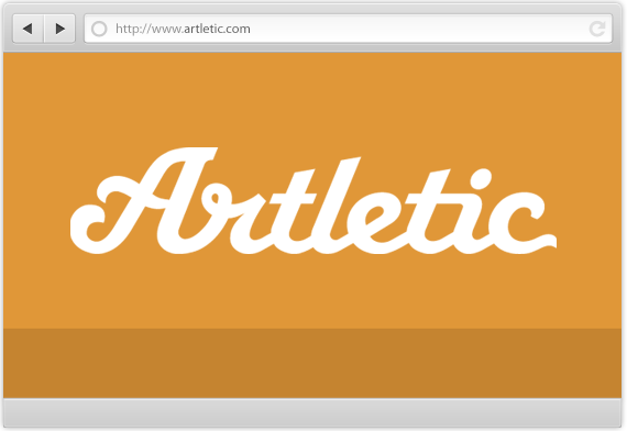
one of the pieces of crazy in my life since my last update is that after a couple years working with my pals at CJRW, i took a new gig with a design shop based in denver called artletic. long story short, my friend arlton works for them and connected me with the owner and all around good guy/mountain man, matt. i’m working from home and while it’s a small sample size (just over a week), i love it.
artletic does some really incredible UI/UX/front-end work and i’m excited to be a part of what they’re doing. i hope to be able to share some of it with you soon.
new start
beyond the new design here on the blog, i’m gonna attempt to be a little more consistent with new posts. i’m not making any guarantees, but i’m gonna make an effort. i don’t have any delusions of grandeur with this blog, but i think it’s still a worthwhile platform for sparking conversation and some critical thought.
at bare minimum, it’s a good place for this introvert to dump the things in my brain. 🙂
i’d love your feedback on the new design. there are most definitely going to be some things broken (i have some browser compatibility things still to work out, for example) and plenty of things to tweak, so let me know if you’re seeing anything funky.
here’s to turning the page and starting new.